
But A Flag Has Flown Away reviews
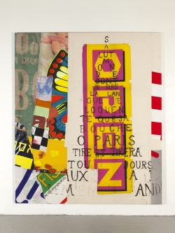
Joe Fyfe, Tour Eiffel, 2018, acrylic, cotton, nylon, 80 x 68 in |
ARTADIA
Joe Fyfe @
NATHALIE KARG GALLERY
"Awardee Spotlight: A Dialogue with Joe Fyfe"
Interviewer: "In your newest body of work at Nathalie Karg Gallery, your artist statement mentions that each piece corresponds to a poem written by Guillaume Apollinaire when he was serving in World War I. Could you talk about how this relationship between poetry and painting came about?"
Joe: "Desperation. I was dissatisfied with a painting I had, um, assembled. I decided to impose the Apollinaire poem, ‘Il Pleut” which is a kind of pictograph made up of a series of diagonal lines of text streaming down the page like rain." (excerpt)
artcritical / the online magazine of art and ideas
Joe Fyfe @
NATHALIE KARG GALLERY
"Joe Fyfe: But a flag has flown away at Nathalie Karg"
"Over the years Joe Fyfe has proven himself a veritable master of understatement. Less is insistently more ... (Francophilia is a point of consistency between this and his prior efforts)" (excerpts)
A review by David Cohen
Read the review (PDF).
TimeOut, JANUARY 26, 2019
Joe Fyfe @
NATHALIE KARG GALLERY
Joe Fyfe, "But a Flag Has Flown Away"
"Funky yet elegant, formal yet throwaway, abstract yet representational — these contradictions define Fyfe's paintings and continue to do so in his latest offerings. With an eye, perhaps, towards the centennial of World War I's final year, the artist bases his latest compositions on a volume of poems written by Guillaume Apollinaire while he served in the trenches with the French army." (excerpt)
Read full review (PDF).
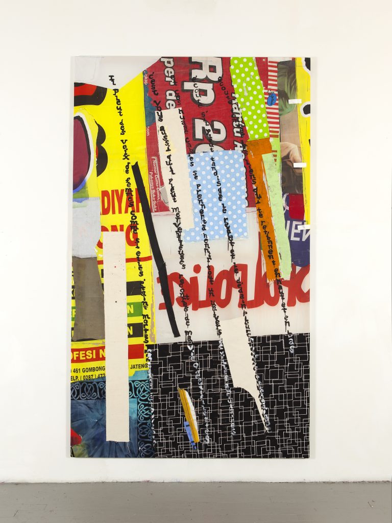
Joe Fyfe, Il Pleut, 2018. Canvas, nylon, cotton, linen, acrylic, 108 x 64 inches |
TWO COATS OF PAINT, JANUARY 26, 2019
Joe Fyfe @
NATHALIE KARG GALLERY
"The materiality of written language"
Contributed by Heather Bause Rubinstein / Joe Fyfe’s newest series of paintings at Nathalie Karg Gallery are packed with visual, poetic and intellectual punch. Fascinated by the possibilities of collaged-together textiles, Fyfe is pushing his work into more formal complexity. Also new is a recurring textual element: hand-painted enlargements of French poet Guillaume Apollinaire’s Calligrammes.
— Contributed by Heather Bause Rubinstein
Read full review .
SCULPTURE MAGAZINE, MARCH 2017
Joe Fyfe @
NATHALIE KARG GALLERY
"Kiss the Sky"
"Kiss the Sky," Joe Fyfe's recent exhibition, was a tour-de-force, seamlessly merging bright colors and quotidian materials, including steel, plastic, nylon, fabric, found wood,
ink, rope, acrylic, and crayon. With
some sculptures zigzagging down
the middle of the long gallery, the
show created a sort of color field so
that the space itself became an
active player in the interaction of
mass, color, and movement.
— Jan Garden Castro
Read full review (PDF).
Joe Fyfe @
NATHALIE KARG
291 Grand Street, 4th Floor
September 14–October 23
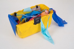
Joe Fyfe, Untitled floor sculpture, 2015
found plastic container, vinyl pennants
7 x 14 1/2 x 8". |
Joe Fyfe is uninterested in the line between art and life, and this isn’t immediately apparent in his work. But his thinking about what he calls the dichotomy of “art and stuff”—his art being made from discarded products and advertising materials—elucidates that seeming indifference. The paintings and sculptures in Fyfe’s exhibition here—many of which incorporate found materials, such as kites and weathered fabrics used for advertising in Korea, which are then repurposed in Cambodia for tarpaulins and umbrellas—are hardly apolitical things. Fyfe himself says he deploys these materials to speak to the contradictions of global capitalism. But the appropriation and unpacking of stuff as such suggests a more reflexive question about what art can really say, or ask, while beholden to these markets. By incorporating his own consumerism in Southeast Asia, the artist preempts his work’s absorption into a market that subsequently churns it out as commodity, or more stuff, leaving art’s political capacity effectively neutralized, to paraphrase critic Peter Bürger.
Fyfe's found objects convey more than just lessons about Orientalism, or the ironies of increased mobility of goods alongside the ever-tightening mobility of people. Two 2015 works, both titled Untitled floor sculpture, variously made up of, among other things, auto parts, a plastic tool container, fake bricks, and lead, showcase both the labor of manufacturing and the politics of culture-making. More to the point, these sculptures underscore how the culture industry and the consumer alike see—or erase—the realities and politics of cheap global labor. “Kiss the Sky” can be read as a show taking aim at the reduction of an avant-garde mindset to stuffdom, revealing the mechanics of its own production, and completing itself once we’ve stepped into the gallery space.
— Tyler Curtis
Longhouse Projects reviews
TIME OUT NY critics pick WEDNESDAY DECEMBER 17 2014
Joe Fyfe, "make me one with everything"
Fyfe's pieces are both formal and throwaway, made of fabrics and found objects ranging from felt and flags to broken umbrellas and cracked automobile bumpers. Some of his materials, including vividly graphic ads in Korean, were rescued from markets in Asia, where he spent some time on a Fulbright scholarship. Hints of Rauschenberg and Tuttle can be seen in Fyfe's work, but it's uniquely and magnetically his own.
Brooklyn Rail February 2015
JOE FYFE make me one with everything LONGHOUSE PROJECTS | DECEMBER 12, 2014 - FEBRUARY 7, 2015
In Joe Fyfe's work, the inherent characteristics of any given material are presented foremost and combined with a sense of highly nuanced formal invention. Materials and objects are sewn, glued, tied, or left leaning together; there is no idealization or "neutral ground" sought for painting — and painting and its possibilities is the subject of this exhibition — as medium specific. Displacement is regarded as a normal state — wood, fabric, and paint gestures are rehomed as fragments of a precise composition. Moving around the exhibition, everything here can be seen as having already existed somewhere else out in the world — be it a banner or a gestural mark, it can also be seen as interchangeable and capable of surprising and unexpected reconfiguration. There are stretched rectangular paintings of different sizes, objects placed against a wall or on the floor. One piece is suspended from the ceiling and several are pinned to the wall, the fabric suspended above or reaching the floor. Framed collages use found elements as well as photographs from Fyfe's travels. A national flag can be a pictorial support, a coat of paint on a fence, a pictorial invention. The idea of the found object, as Duchamp would have it, is turned on its head, as it becomes one more resource for painting. Though Fyfe is primarily an artist, he has also written on art and curated exhibitions.
There is no high and low in Fyfe's work, everything is, one senses, fair game. Though having said this, it is clear that in the particular selection of materials, often objects or fabrics found out of doors and many from his travels in Vietnam and Cambodia, indicates an interest in the way quotidian forms of urban or rural improvisation — the building of dwellings or fences, decorative and practical use of material — reflect socio-economic realities of local people. Fyfe resourcefully makes use of obdurate materials, whether patching a wall or using collage in a painting. Improvisation, re-use, and reconfiguration are all at play. "Cradle" (2013), a black broken car fender containing a piece of black fabric and an incomplete sign with the letters, "k-i-n," is situated high on a wall. What the piece is materially is clear, as is the connotation of the title. However, in considering the piece formally and conceptually there is as much humor or gravitas as the viewer decides, given the fractured quality of the constituent parts and the Beckett-like deftness of their piecing together.
In response to a question from Keith Sonnier published in a catalog in 2012 — the text of which consisted of 20 questions from artists and writers invited by Matthew Higgs — about the relation of material and concept to form, Fyfe quoted the British architectural critic Reyner Banham, who had defined Brutalist architecture as having three main qualities: formal legibility of plan, clear exhibition of structure, and valuation of materials for their inherent qualities as "found." Fyfe identified with these qualities to such an extent that he said it closely approximated his artistic program of the last 20 years. Fyfe clearly brings about results very dissimilar to the Brutalist buildings themselves: it is only in the use of materials for their individual qualities together with the clarity of their combination that any aims are shared. Visiting the Blinky Palermo and Imi Knoebel exhibition at Dia Foundation in 1988 proved crucial for Fyfe, and it's not difficult to see the connections in this current exhibition — in the directness, lightness of touch, and willingness to work paintings' formal elements beyond a simple geometric frame.
Returning to the rectangle in some cases, take "Bull" (2014), or "Large Kappabashi Painting II" (2014), Fyfe resolves compositional issues within a shape that he has shown to be optional rather than a given in his own painting, as well as in so doing aligning himself with a tradition of post-1945 French painting, namely the Supports/Surfaces movement, that he has played a part in bringing to the attention of a North American audience. Overlooked in comparison to developments in painting this side of the Atlantic, artists such as André-Pierre Arnal and Claude Viallat — both included in Canada's 2014 Supports/Surfaces exhibition, for which Fyfe provided one of the catalog texts — are beginning to finally get their due.
In terms of assemblage or collage, Fyfe tends to recall the lyrical abstractions of Serge Poliakoff rather than Rauschenberg, say; the fact that they are freestanding objects and wall-based three-dimensional pieces notwithstanding. This could have to do with Fyfe and Poliakoff's pictorial and compositional affinities, rather than an interest in the extension of sculptural forms per se, and an insistence on abstraction despite the many text fragments or photo images incorporated into a piece. In shifting registers between formal precision and street reclaimed material, Fyfe is in fact recasting aspects of abstraction. There is a lightness of touch evident throughout the exhibition that results in a formal balance devoid of overworking. It is in Fyfe's willingness to present found materials for what they are and place them in new configurations that he succeeds in extending ideas about painting beyond the necessity of a rectangular window of space — to its limits, but no further, as painting remains his key subject. To go further would be to forego this.
David Rhodes
ART NEWS REVIEWS MARCH 2015
JOE FYFE AT LONGHOUSE PROJECTS
BY Lilly Wei
Joe Fyfe's recent exhibition was almost baroque, verging on "everything," as promised by its title, "make me one with everything," the start of a Buddhist joke involving a hot dog. Rooted in the likes of Beuys, arte povera, Rauschenberg, and Richard Tuttle, these works, made from a rich and motley trove of materials — felt, cotton, flags, bricks, tires, a black car bumper, drums, a capsized umbrella, signs, and more, were set on the floor, hung on walls, and suspended from on high. They were the discards of daily life that Fyfe salvaged from Vietnam and other Southeast Asian countries where he likes to wander. His collages here were particularly gratifying, a lyrical balance of painting, bright graphics, photographs, and found items on canvas, cardboard, and paper.
Though seemingly effortless, based on serendipitous, sensitively inspired pairings, the works were held together by a formal intelligence that belied that nonchalance. His is a populist art for the cognoscenti, a wry transfiguration of the insistently commonplace, one that is not without political rumblings. Fyfe's creations also take the temperature of the region's transitions, its growing materialization and globalization, with a nod — the Union Jack that emblazons the surface of Bull (2014), say — toward its complicated past. The oddly appealing, cobbled-together Bench (2012–14) of uncertain durability is poignantly symbolic.
A version of this story originally appeared in the March 2015 issue of ARTnews on page 83.
BOMB Magazine Winter 2014 Looking Back 2014 MaryAnn Monforton
Joe Fyfe: Make Me One With Everything at Longhouse Projects, NYC offers a major league exhibition by the art world's favorite artist, professor, critic, curator and curmudgeon. The title, Make Me One with Everything, references a joke where a Buddhist monk orders a hot dog. Long House Projects presents a museum-quality exhibition, one with everything. The hot dog (which usually refers to surfers and skiers) is the highly accomplished artist and risk-taker Joe Fyfe.
Le Tableau reviews
New York Sun June 28 2010 Orgy in the Raw
Joe Fyfe, a painter known for his stark, almost belligerently informal abstraction, is also a critic and curator. In "Le Tableau," a geographically and historically wide-angled summer group exhibition at Chelsea's Cheim & Read Gallery that he has organized, Mr. Fyfe pugnaciously shakes by its horns the Francophobia of the American critical establishment. The show pairs contemporary practitioners from both sides of the pond known for their almost semiotic interrogations of a painting's support with 1950s and ‘60s "tachistes," as the French liked to call their abstract expressionists: Jean Fautrier, Hans Hartung, the Canadian Jean-Paul Riopelle, and that quietly lyrical genius of sumptuous tones, the Russian-born Serge Poliakoff. These guys were big names at the time. But while they continue to command a loyal collector base in France, where they are often found in the concluding room of regional fine art museums, they are completely marginal to the official history of post war art promoted in the United States. Such "old masters" rub shoulders with Paris-friendly yanks such as Joan Mitchell, who resided in the city of lights for much of her time, and Milton Resnick. The result of Mr. Fyfe's revisionist experiment is, quite apart from its critical or historical validity, both a tactile and a visual orgy of raw textures, smeared impastos, and punctured supports. DAVID COHEN
New York Times July 2, 2010
In the mid-1960s, when it was widely assumed in this town that the fate of abstract painting lay pretty much in the hands of artists who resided between the East River and the Hudson, it is said that Frank Stella taught his very young daughter to say the phrase "French painting is bad painting." True or not, this program of indoctrination illustrates the sense of America's dominance of painting at that moment.
Joe Fyfe, a New York painter and critic who briefly lived in Paris, organized "Le Tableau" as "a pointed counterbalance to the rejection of French painting by the American artistic and critical establishment." I'm not sure how much counterbalancing can be achieved with a group of 25 canvases, of which 17 date from the last decade, given the complexity of the argument. The men and women who made them divide fairly evenly between Americans (including some expatriates in France) and Europeans (mostly French). The works spread over nearly a century of art history, from Jean Fautrier (1898-1964) to Bianca Beck, who was born in 1979.
But the show reminds us that quality is as much a matter of authenticity as invention. What counts is the impact of the individual work on the individual viewer, and the way painting echoes through painting.
There's plenty impact and echoing here. A tiny clogged canvas by Jean-Paul Riopelle from 1967 could easily have been painted by Louise Fishman, whose more expansive work hangs opposite.
Between them a large fluttery work by Daniel Hesidence contradicts the compression of its opposite number: Fautrier's small slab of white paint tinted pale red on green. The sparse, tilelike geometry of a 2009 work by Bernard Piffaretti parses the voluptuous blues and greens of a 1977 canvas by Joan Mitchell.
Adjacent paintings by Richard Aldrich and Juan Uslé sparkle on the subject of bare canvas, hard edges and green. Works by Merlin James, John Zurier, Katy Moran, Sarah Rapson and Jean François Maurige are among several others that reward close attention.
As for some of the rest, Rachel Stella was not always wrong. ROBERTA SMITH
Wall Street Journal August 21, 2010
The received wisdom holds that with the triumph of Abstract Expressionism — and the subsequent success of minimalism, pop art and conceptualism — the School of Paris fell to a distant second place. I don't agree and neither does painter and critic Joe Fyfe, who organized "Le Tableau: French Abstraction and its Affinities," an uneven, theory-laden group show of 25 abstract paintings.
"French," as opposed to "American," abstraction cannot be encapsulated. In postwar art it includes artists as diverse as Arp, Hans Hofmann, Sonia Delaunay, Ellsworth Kelly and André Masson. "Le Tableau" is a mishmash of work from the '50s to the present. Some artists, such as Jean Fautrier and Hans Hartung, are well-known. Others, such as Merlin James and Jonathan Lasker, are overrated. Among the appealing pictures are Serge Poliakoff's "Orange et Bleu" (1951), Mr. Fautrier's "Terre D'Espagne" (1956) and Mr. Fyfe's "After Corot" (2007). Many paintings here, such as those by Jean Paul Riopelle, Louise Fishman and Milton Resnick, are closer to Abstract Expressionism. The same is true of Joan Mitchell's "Untitled" (1977). In veiled greens, browns, blues and ochers, this showstopper is aquatic and earthen. Ms. Mitchell, an American student of Hofmann has by far the most "French" work in the exhibition. LANCE ESPLUND
TIME OUT NY August 19, 2010
Arguing that postwar French painting never received its due from chest-beating American critics blinded by the glories of Abstract Expressionism, New York artist and critic Joe Fyfe has assembled a selection of work from both sides of the Atlantic in a modest attempt to redress the balance. Whether one is convinced by Fyfe's somewhat inside-baseball thesis or not, it allows for the side-by-side airing of a variety of both well- and lesser-known artists, whose works are installed with a painter's eye for formal contrast and coincidence. It's also a reminder that the French, unfairly maligned or not, were responsible for a string of late-20th-century movements, including Tachisme and Support/Surface, posited on the expansion of painting's material possibilities.
But while the show reaches back to Serge Poliakoff's 1951 canvas, Orange et Bleu, "Le Tableau" is biased in favor of much more recent works, and these are — with some exceptions — the best in the show. The pairing of Fyfe's own After Corot (2007) with Claude Viallat's Untitled No. 318 (2008) is an effective one, both works switching out standard canvas for alternative fabrics. And the juxtaposition of John Zurier's cool, calming Swedish Green (2), from 2006, with Jean François Maurige's intense scarlet Untitled from the same year is similarly invigorating.
If "Le Tableau" is sometimes conceptually self-defeating in bundling modest European works with bolder American counterparts, the inclusion of a fiery Hans Hartung and a joyous Joan Mitchell diptych make it worth a visit, whichever side of the Atlantic one ultimately prefers.-- Michael Wilson
The New Yorker August 5 2010
A mildly polemical group show posits the lasting relevance of post-Second World War Parisian abstract painting, which was occluded by what the painter Joe Fyfe, who curated, calls "American triumphalism." (But Abstract Expressionism was really a triumph, n'est-ce pas?) Fair-to-good examples of Tachisme, Informel, and Support/Surface — from Jean Fautrier and Hans Hartung to Claude Viallat and Daniel Buren — background recent efforts by an international cohort including Fyfe himself. The case weakens with superb new work, by the likes of Charline von Heyl and Sarah Rapson, which eschews Gallic compression for American-type elbow room. The show's star is the aesthetically bilingual Joan Mitchell.
ArtCritical.com July 23 2010
Le Tableau, curated by painter and critic Joe Fyfe, is a typical example of what happens when hermeneutic hypothesis trumps the ability to discern qualitative significance in painting. There is a tendency in synchronic exhibitions these days to foreground an explanatory text in such a way that the works chosen become merely ancillary to some theoretical proposition. In the case of Le Tableau, without the printed, accompanying text, it would be different to grasp exactly what this exhibition is trying to tell us. Fyfe separates his concerns as artist, critic and curator from the legacy of Greenbergian formalism by advocating less the concept of "the flatbed picture plane" and more the "material means and/or structure of painting as a form or figure" as, for example, found in post-war French painting from the 1940s and ‘50s.
In fact, I'm fully in support of reviving attention to post-war French painting, based on my own experience in seeing works of these painters in the late 1960s on my first excursion to France. Even so, and in spite of Fyfe's handsome text, there is a paucity of work in this exhibition that catches a glimmer of what this mid-century period in the recent French painting (at least from this American's perspective) was all about. Le Tableau is a gathering of a few modestly scaled Ecole de Paris paintings by Jean Fautrier (measuring just under 9 X 11 inches), Serge Poliakoff, and the French-Canadian Jean-Paul Riopelle ( 7 X 5 1/2 inches) along with a recent work (2009) by Supports/Surface painter Claude Viallat, whose rise to prominence came in the 1970s. A mediocre painting by the otherwise remarkable Hans Hartung is included, yet pales beside anything that was shown in that artist's phenomenal retrospective at the Maeght Foundation in San Paul de Vence in 2008. There is no work by Pierre Soulages, Wols, Gerard Schneider, or Georges Matthieu to stand in support of the eclectic, motley choice of slightly larger works from recent French and American artists. An exception is the sumptuous Untitled (1959) by Joan Mitchell, who can be claimed equally by America and France, particularly in this most heraldic moment of her development. Fyfe is generally correct in characterizing Mitchell (from the late 1950s) as "an insouciant semiotician of the painterly mark." What made these paintings so eminently important for Mitchell was her propensity to stop short of de Kooning's sweeping brushwork, and to focus intensively and unabashedly on destroying the surface. Paradoxically she maintained the force of restraint so as not to kill it entirely as her anxious marks became signifiers of an explosive, personal content, both self-determined and utterly convincing.
The exhibition also includes Kate Moran, Jonathan Lasker, Merlin James, John Zurier, Juan Usle, Jean-Francois Maurige, and the late Milton Resnick, among others. Fyfe participates in the exhibition himself with an elegant sewn work using felt, cotton, and jute (from Southeast Asia), and thereby implies that the French approach from the 1950s is his own proper context. The positioning of one's own work in such an exhibition is perhaps more problematic today than it would have been three or four decades ago, a time when the overall emphasis on the market was known but considerably less obvious than it has become. While Fyfe may hold a clear commitment to the intellectual aspects of advanced painting, the presence of his work in Le Tableau appears somewhat overstated.
Reopening the book on Michel Tapié's Art Informel and Tachisme is certainly welcome, but the kind of contiguity and consistency between then and now is simply not clear in the works selected for this display. The balance is off, and the installation is often awkward. There is not enough strong work from the early period in Paris to get a definitive idea as to where recent abstract painting from New York and France may have found an unforeseen place in the current century. Fyfe's comparison of two nearby Chelsea buildings by architects Frank Gehry and Jean Nouvel as a way to characterize the extreme aesthetic differences between America and France I find to be absurd. Whether one agrees or disagrees with the kind of abstract painting advocated by Greenberg, criticism based in qualitative judgments is still relevant. This is where the application of theory in terms of justifying much of this exhibition becomes highly problematic, and where Le Tableau falls short of its potential. Even so, whatever one may think of the thesis of this show, a new look at postwar French painting relative to the present deserves more institutional support as better works by these earlier French artists could have turned this rather hesitant exhibition into something of real significance. ROBERT C. MORGAN
Modern Painters August 26, 2010
It is a surprise to see work by many of the artists in Cheim & Read's argumentative summer show. That's not because they are young and untested, like the participants in quite a few summer shows, but because they are older artists, whose work has been out of fashion for so long. That applies to French abstract painters like Jean Fautrier and Jean Paul Riopelle, Hans Hartung and Martin Barré — rising stars in 1950s Paris who were eclipsed, according to most accounts, by a band of scrappy, hard-drinking painters in New York. But now a reconsideration of their work has begun.
Achim Hochdörfer took up that project last year in Artforum in an essay entitled "A Hidden Reserve," and citing that essay in "Le Tableau's" poster-catalogue, painter Joe Fyfe continues the charge as curator of this commendable show. "French painting now seems timely in that the identifiably American notion of the 'flatbed picture plane' appears banalized, having exhausted most options left for abstraction," Fyfe writes. About half of the exhibition is devoted to work by those marginalized Frenchmen (most from the 1950s and 1960s), while the other half is filled with contemporary pieces by their ostensible followers.
The first piece one sees, a diptych hanging over the gallery's front desk, is covered with thick strokes of dirty browns and oranges, and short passages of subdued blues and pinks. It could be a work by Frank Auerbach from the 1950s, but it's actually by the young British artist Katy Moran and dated 2006. It is a persuasive summary of Fyfe's thesis and makes for a cannily uncomfortable start to the show: any lingering beliefs about the evolution of style or the notion of a teleological aesthetic development need to be discarded.
Fyfe writes that America's Abstract Expressionists wanted "to reduce painting to a single trope" — consider Pollock's "skeins of spatter" — while the French of the time were opting for a more full-fledged exploration of the painted surface. (Robert Ryman would seem to be a missing piece in this narrative.) The French also favored an unapologetic repudiation of certain sensibilities of abstract beauty. While works by Pollock, Rothko, and Still pulsed with energy, their canvases were sometimes intentionally mannered, as in a mold-colored Fautrier from 1956 that is frosted with a few deliberate bands of unpleasant pink paint: it is gloriously ugly.
In some works, the Europeans appear to take stabs at their reigning cross-Atlantic rivals, as in a 1963 Barré, which is a white rectangle touched with a lazy horizontal black line — an avowedly nonchalant, low-key version of Barnett Newman 's heroic zips. A 1981 Hartung is an amber square splattered with black paint in a few places by someone who has heard about, but never seen, a work by Pollock.
The contemporary works prove more consistently rewarding. A large, weird Charline von Heyl — a toothy black blob floating across a bed of lines — looks even weirder surrounded by the Frenchmen's pieces, and a small Richard Aldrich — a few faint dabs of browns with a tiny triangle in one corner — one-ups its forefathers with only a few gestures that comprise an expansive compendium of technique.
Forty years ago, identifying art's shift from a vertical, representational mode to a horizontal, flatbed picture plane, art historian Leo Steinberg argued that art was moving "from nature to culture." If, as Fyfe maintains, that very-American flatbed plane — that record of culture — has become "banalized," one wonders what the current return to outmoded abstraction (forged in another troubled, uncertain time) portends.
Andrew Russeth
Reviews for solo exhibitions
Art Review: Reality rendered in vibrant colors
By Fredric Koeppel
GoMemphis.com
March 2010
While abstract art in its character would not seem to be about "Real Things in the World" -- the title of Joe Fyfe's exhibition at David Lusk Gallery -- the artist reminds us that color and pattern and relationship are as real as oranges and mountains and that there are many ways of imitating nature and the works of human hands.
"Real Things in the World" is a small but impeccable exhibition that beautifully balances exuberant color with formal restraint and the seemingly random with the fastidious. Fyfe, a New Yorker showing in Memphis for the first time, employs common materials -- paper bags, felt, cotton towels and muslin, as well as crayon and watercolor -- to create works that contain strong graphic elements.
Joe Fyfe's "Markplatz," made of various fabrics, is among the artist's abstract works that show the influence of old signs and once-postered walls.
A clue to Fyfe's method lies in two of his color photographs included in the show. "Sisowath Quay" depicts a street vendor in Phnom Penh, Cambodia, leaning into a cart to get something for a girl standing with her back to the viewer. The vendor wears a teal shirt, pink slacks and a blue hat; the cart is orange, except where scraped-off paint reveals light blue patches; the girl wears a bright yellow shirt. The juxtaposition of these hues imposes a riot of sensation, a visual feast of incongruity. In "Basel Window #2," a display of multicolored, striped, checked and polka-dotted bedding dazzles the eye.
It takes no effort at all to turn from these photographs to large pieces like "Marktplatz" (54 by 64 inches), with its strips of red, orange and white-dotted fabric, or "I Primi" (36 by 51.5 inches), in which a bold vertical section of eggplant purple abuts a whimsical U-shape of red topped with yellow capitals surrounding what feels like a vast field of negative space created by a rectangle of unpainted muslin. Clearly we see here the influence of old, faded signage; of portions of walls that have held generations of posters and been scraped and painted again; of automobiles repainted in patchy pigments; of the color-blind concatenation of the world's fashions and furnishings.
In works like "Maroon Window" and "Large Window with Pink," the first composed of rectilinear patches of dyed cotton and felt, the second a more irregular assemblage of dyed cotton, felt and silk burlap, the resemblance to folk quilts seems deliberately to evoke a sense of modernist domesticity (what's more homey and comforting than a quilt?) while the references to windows imply a quality of architectural space reduced to its most fundamentally geometrical. We see nothing through these windows but ideas of windows, and even ideas of windows are "real things in the world."
Fyfe is at his most subtle in two collages of about 30 by 24 inches and two drawings of about 25 by 19 inches. The first two remind us that collage, or at least mixed media, in all its ramifications is the 20th century's most important contribution to the visual arts. Again leaving considerable space to speak for itself, Fyfe artfully and spontaneously uses scraps of cloth and paper and sprinkles of ethereal blue watercolor to assemble fields of activity that feel both urban and tranquilly Asian.
Even the utter simplicity and sparseness of the smaller abstract drawings offer exquisite evidence that, as poet William Carlos Williams wrote, "There are no ideas but in things."
--------------------
Joe Fyfe, "Real Things in the World," with Bruce Brainard, "Recent Paintings"
Joe Fyfe: James Graham & Sons
by Lamar Clarkson
ARTnews
May 2009
With his blocky, minimalist paintings —
made by collaging squares of colored
fabric — Joe Fyfe pushed abstraction into
a more physical realm. For this streamlined
yet spirited show, he used a "palette" of muslin, cotton, felt, silk, burlap,
and even the occasional festive print or
cotton appliqué to turn the otherwise
ascetic appearance of minimal color
forms into a grab bag of textures and
sensations. In Marktplatz (2008–9)
swaths of orange, gray, red, and polkadotted
rose dance in a stripy flag configuration,
while Square Curtain (2007) — a
sheath of bright blue appliqué-spangled
fabric — droops from the wall like a pair
of baggy drawers.
The strongest paintings here, though,
were both more restrained and, even at
two feet tall, more monumental. For
these meditative pieces, featuring simple,
boxy shapes, the artist limited himself
to an earthy palette of warm brown
and beige. Nun (2007), for instance, is
dominated by a dog-eared brown square
that nearly fills the frame, its edges
muddy and ethereal, like a Rothko in
miniature. But what seems immaterial in
a Rothko is wholly physical in a Fyfe:
Rothko's soft, fuzzy borders blending
beige and brown were here simply the
frayed
edges of
brown
cotton
fabric.
Rothko's
ethereal
boundary
is, for
Fyfe, a
hemline.
Fyfe
goes one
step further
in
the playful
Bed
(2007).
Divided
into rectangles
of
brown
cotton on top and beige muslin on bottom,
the work would be unambiguously
abstract if it weren't for the slight layering
of muslin over cotton. With its frays
pointing pertly up, the muslin reads seductively
like the trim of a sheet
stretched up to reach a pillow.
Joe Fyfe: Recent Work at James Graham & Sons
by Stephanie Buhmann
ArtCritical.com
February 5 to March 7, 2009
32 East 67th Street
New York City, 212 535 5767
In his current exhibition of recent work, Joe Fyfe offers two distinct directions.
One room is solely dedicated to a series of rather restrained abstract canvases. Except for one painted piece, all of them are made of oxblood-colored cotton cut outs mounted on muslin. The overall sensibility is minimal, showcasing each distinct shape as sole gestural mark. They are elegant studies of the basic ingredients in art: light, positive and negative space, line and texture. Their impact is immediate and yet, upon further observation they turn into blank canvases for our imagination. As they leave us pondering what larger truths they might behold, Fyfe does not shy away from sharing his own associations by providing simple and interpretive titles, such as "Nun," "Priest," or "Door."
The second room features a variety of paintings that are rich in color and ooze lightheartedness. Here, patterned textiles (a more recent development for Fyfe) are combined with pieces of felt, silk, painted or neutral jute or burlap. The inherent freedom of expression and joy in interrelating different materials bring the art of quilt making, as well as collage to mind. There is a striking looseness in these works that most clearly manifests in two works, Long Curtain and Square Curtain (both 2007). Hung from the wall, un-stretched, with seemingly countless holes, of which some have been filled out with saturated felt or fabric pieces, they contain the poetry of a starry sky and the luminosity of a stained-glass window in the afternoon sun.
While Fyfe has worked with combining more traditional methods of painting with textile collages for years, it is through the overt focus on counterparts in this exhibition, contrasting the more serious with the playful and the reserved with the whimsical, that Fyfe reveals both the diversity of his artistic interests and the extent of expressive versatility he has reached in his work. Much of this maturity can be credited to Fyfe's extensive travels in recent years. After receiving a Fulbright Independent Research Fellowship in 2006, he spent six months in Vietnam and Cambodia and in 2007, and also participated in a residency program in Switzerland. Particularly in regards to his palette, Fyfe has noted that the exploration of different countries and cultures has expanded his color repertoire and that he accesses "that palette by shopping in a given country's fabric markets and making my work with that colored material."
But there also is an increasing sense of physicality in Fyfe's work, which in the case of Long Curtain and Square Curtain can even lead to a true sculptural quality. This strong awareness of the body and its relationship to an object – and to Fyfe, a painting is indeed a physical object - also might have very well manifested in the very physical experiences a traveler collects. While passing through different time zones and climates, absorbing different voices, smells and tastes (not to speak of the visuals), we certainly test our bodies and senses in new unusual ways. Whatever Fyfe might have found or gathered abroad, he certainly has succeeded in developing a language free of geographical dependencies and without time constraints.
FEBRUARY 10, 2009 11:02 PM
Mark Brandl — Sharkforum Blog
I've been meaning to write about this for some time, but kept getting sidetracked by other events. Last summer, I met the very interesting painter and "writer on art" Joe Fyfe.
Unfortunately I was in the throes of completing my three years of learning Latin and preparing for and taking the day-long final examinations, as well as painting for a couple of shows and teaching. Thus, I didn't get more than one real meeting with him, visiting him at the studio where he was staying and having lunch in the restaurant surrounded by the Pipilotti Rist's "Kunst am Bau," a giant red outdoor lounge. I agree with what Joe said, that it is not a metaphor that really attracts me. It was gutsy of the city to pay for and install it (most Kunst am Bau is rather flaccid, decorative geometric nonsense or quasi-event neo-conceptual entertainment novelties). Nevertheless, it doesn't hold together well and is ageing quickly and poorly.
Fyfe was doing a visiting artist/scholar residency at Felix Lehner's wonderful fine art casting foundry, a place I should hype more. St. Gallen, Switzerland is fortunate to have two of the world's best artisans-serving-fine art: Urban Stoob, a famous and remarkable stone lithographer about whom I'll write another time, and Felix Lehner.
In the Sitter river valley, a small yet dramatic drop from the surrounding area, west of the city, an industrial (more formerly than now) area is located. Here, a former textile dyeing factory was converted by Lehner into a foundry. Within 10 years it had international renown. Over a dozen expert artisans assist artists in the production of sculptural works as well as occasionally restoring important historical bronzes. And generally of very large proportions.
Felix Lehner, the founder and boss of the foundry is highly knowledgeable of contemporary art. Furthermore, he is the initiator of the "Sitterwerk" a permanent conglomeration of a handful of buildings forming a private art center (link), including a monographic museum, Schaulager and library. One area is dedicated primarily to Hans Josephsohn, a unique sculptor who you should google. The Sitterwerk and Foundary's website in English is here. The site for the Josephsohn museum, situated in the former boilerhouse, hence called the Kesselhaus, is here.
Fyfe, besides painting his own works, was there to research and rewrite an essay for Art in America on Hans Josephsohn. Fyfe had just returned from an extended stay in Southeast Asia. Fyfe does some highly unique artworks wherein I see shades of Blinky Palermo cavorting with the soul of Matisse. Generally described, he stitches and glues found fabric together, abutting the elements rather than collaging them, and then applies very sparse strokes of paint. Very atmospheric, clear-sighted, elegant and historically aware. His writing is similar. Some bio minutiae: Fyfe was born in NYC in 1952, received his BFA from the University of the Arts in 1976. He has had recent solo shows of his paintings at JG Contemporary in New York City, and at Mai's Gallery in Ho Chi Minh City, Vietnam. He has been in recent shows at Tracy Williams Ltd. and Cheim and Read in NYC, Galerie Pitch in Paris and The Myers School of Art in Akron, Ohio. He has taught at Parsons, VCU, Temple and UT, Knoxville. He has received grants from The Pollock-Krasner and Gottlieb Foundations and he writes for Gay City News, Art in America, Arts AsiaPacific, Art on Paper and Artcritical.com.
I felt an immediate affinity with Joe, and a similarity of perception, strangely enough, as our individual aesthetics are superficially so different. I would have liked to talk longer and repeatedly with him. Well, another time!
Joe Fyfe, Paintings 2004-2007
Stephen Mueller, Gay City News
at JG/Contemporary, through March 10, 2007
Joe Fyfe's show at JG Contemporary is sure to elicit comment, attention, and even some ire. The work dated from 2004 to 2007 has built in challenges to those who have set ideas about what art is and Fyfe would have it no other way. The paintings are made from pared down elements and precious little paint. They are all constructs of burlap, felt and the odd other piece of fabric and some paint. Fyfe associates himself with French Culture, both philosophy and practice. A particular favorite interest of his is the recent support/surface movement in French painting which, generally speaking, is a kind of truth-in-advertising bare bones approach to the processes of painting making. This is, in some ways, an extension of doctrinaire American modernism (a la Greenberg) wherein depictions of space in any manner, expressions of feelings, narrative and above all sentimentality are all eschewed in favor of an obvious presentation of process and materials observing, above all, the flatness of the picture plane. Of course the contemporary French version of these ideals is more complicated and loaded with philosophical ramifications. Fyfe operates with a contrarian's esthetic, an extreme version of the searching sensibility that most artists employ to discover new visual territory. Fyfe has discovered new visual experience through the use of ephemeral materials and a brevity of touch and attention. Simply gessoed (white washed) burlap is usually the starting point for most of theses works. Areas of intensely colored felt are sometimes pieced into the burlap offering a jarring contrast in texture and corporeality. Muslin, terry cloth and linen are among the other materials used. Slight stains or abbreviated shapes in other colors are sometimes added. This all sounds very slight but the effect is astonishing and at times the presence of the piece is indelible as well as very beautiful. Though abstract, the work usually assumes a landscape-like orientation. The viewer is obliged to consider every nuance, regardless of how slight, as a possible clue to meaning and completeness. La Gloire, a large vertical painting in the show is burlap interrupted by top to bottom bands of felt in intense red and blue, a faded green washcloth and linen with some strangely rain bowed acrylic stains. The first impression of Barnett Newman zips is quickly displaced by a beachy poetry and something more akin to an evasive memory than modernist cant. The back view of one of these paintings being moved across a room reveals what odd fragile creations they really are. On the wall they assume the look of a rather textured painting. Fyfe's work bears a passing resemblance to some of he work of Alberto Burri, a fifties artist who also worked with assembled burlap (among other things). However, Fyfe has no concern with composition and design as such and no existential axe to grind, at least in the work. Fyfe works intuitively assembling, disassembling and altering until a certain note of right nonchalance is struck. His influences are Asian, in the acknowledgment of temporality (a core Buddhist concept), and the history of western painting. The results are a singular pleasure and as unpredictable as they are inimitable.
James Kalm, The Brooklyn Rail, April 2007
Artist, writer, and curator, Joe Fyfe, a well-known Brooklyn art advocate, has recently been working in Cambodia and Vietnam as a Fulbright Research Fellow. His uptown show, at James Graham & Sons, is a selection of works inspired by his travels. Although Fyfe has a reputation as a prickly and "serious" Fyfe's signature burlap supports are cut, spliced and glued back together with narrow hunks of intensely colored felt and fabric functioning as compositional cross members. The lightness and supple character of the
paintings are reiterated by their loose attachment to their supports, more draped than stretched. Be-cause the hues of the added fiber elements are dyed rather than applied, they contrast intensely with the washy, white-stained burlap. Accumulations of skuzzy lint, stray threads and patched holes imply a kind of hobo chic aesthetic while carrying material analogies to the drips, splatters, and smudges of Abstract Expressionist painting. These works feign an austere formalism while remaining as endearingly shabby as Charlie Chaplin's "Little Tramp."
Joe Fyfe
The New Yorker, March 12, 2007
Several of the paintings in this show were created in Vietnam and Cambodia, where Fyfe is currently on a Fulbright Fellowship. One wants to cite the influence of Southeast Asia on this new work. But, perhaps for the better, Fyfe has stuck to his guns, creating his signature abstractions, in which the textured warp and weave of the nubbly burlap surface competes with structured layers of flat color for the viewer's attention. Works with titles like "Hoan Kiem" and "Boeng Kak" (the names come from lakes in Vietnam and Cambodia) reveal his current interests and whereabouts, even if the visuals don't. Through March 10. (Graham, 1014 Madison Ave. 212-535-5767.)
"Minimalism with Feeling"
David Cohen, Artcritical.com & New York Sun,
February 22, 2007
Joe Fyfe is a brutalist. His art is not so much reductive as severely blunt. Often, the "canvas" is more striking than the paint: in "La Glorie" (2006), for instance, a picture painted in acrylic on terrycloth, felt, linen and burlap. Colors and textures alike are intrinsic, in other words, rather than applied. The composition has a central zip of various colors (painted bars or collaged strips of colored material) placed off center on a burlap ground crudely roller-painted in thin, dry white. The surface submits to the support.
Historically he comes out of art of early 1970s: He was much influenced at the outset of his career by an exhibition of Blinky Palermo, an artist included in the National Academy Museum's current "High Times, Hard Times" survey of painting in the wake of Minimalism. He is also one of several Americans (others of his generation being James Hyde and Craig Fisher) who have looked hard at the French Support-Surface movement. But his new body of work seems much less concerned with the semiotics of painting as earlier efforts.
The exhibition includes things made in the last four years and is more compositionally busy than the previous show at the same gallery. Titles reflect his travels in Asia (a recent Fulbright took him to Vietnam, Cambodia and Laos). There is still an insistence on texture over shape, however; while "Hoan Kiem" (2006) seems almost pictorial in the way menhir-like shapes populate a white ground with a gray skyline, the eye is still detained by the rough scrapings away and rude applications of paint accentuating the materials beneath, in this case felt, muslin, burlap and gauze.
 Joe Fyfe: Paintings 2004-2007 Joe Fyfe: Paintings 2004-2007
New York Times Made with acrylic, crayon and sundry appliquéd fabrics on rough-grained burlap, these weirdly tactile, quietly opulent paintings evoke the history of Modernist painting with wit and homey craft. Motifs familiar from the art of Barnett Newman, Paul Feeley and Robert Motherwell, as well as more generic riffs, seem weirdly magnified, even brutal. The sharper palette of Color Field and the formal reticence of Minimalism are deployed. Like the more fashionable painter Sergej Jensen, Mr. Fyfe makes the argument that there is more than one way to be pictorial, but with greater deliberation and visual rewards. The problem is that beyond their engaging physicality and intelligence, these works often stay too close to their sources, which makes them feel cautious. J G Contemporary, 1014 Madison Avenue, at 78th Street, (212) 535-5767, jamesgrahamandsons.com; closes tomorrow. (Smith)
Joe Fyfe
by Stephanie Buhmann
Brooklyn Rail, April 2005
Paintings from Vietnam
James Graham & Sons
Joe Fyfe, "Portrait" (2004), acrylic and felt on burlap. Courtesy of the artist.
In a current exhibition of works from 2004, all of which were conceived and completed during a visit to Vietnam, Joe Fyfe reiterates his self-appointed task to clear out the busyness in painting in order to examine the basics: the image of the work and its physical presence, as well as the inherent relationships between image and light, pigment and surface. In order to decipher these, Fyfe keeps his materials as undisguised as possible, treating them with almost equal importance as the artistic process and even the finished work itself. Applied to rough burlap that is stretched over canvases ranging from intimate to large scale, translucent layers of white paint build up the ground on which Fyfe establishes finely tuned nuances between abstract forms.
Though Fyfe insists that it is the impersonality of the elementary concerns of painting that continues to intrigue him, Paintings from Vietnam can hardly be characterized as neutral or emotionally detached. With an undeniable meditative simplicity, each work manifests itself as the reflection of a thought, which may be private and secluded from an audience's distinct interpretation but nevertheless is as unarguably existent as the abstract form of a shadow. In fact, as demonstrated by works simply titled "Rivertown," "Red Balloons," or "Small Danu Bhum," the overall concept is reminiscent of diary entries, in which the viewer is led through brief yet specific details of the artist's resonant cultural adventure in 2004, when he was invited by Mai's Gallery in Ho Chi Minh City (formerly Saigon) to work and exhibit in their space. While Fyfe had traveled to Vietnam in the past, it was the unusual experience of working toward a finalized project and within a given deadline that enabled him to encounter Vietnamese culture and the country's natural environment more intimately. Cham sculptures and ancient pottery seen at Saigon's museums had a deep impact on Fyfe's perception, as did his attempt to establish a dialogue with various contemporary Vietnamese artists.
In only ten days, while absorbing the rich impressions provided by local city life, Fyfe completed Paintings from Vietnam. Whereas in the recent past it was the occasionally emerging conglomerate of light blue-green dots or thoroughly contemplated brushstrokes that held the viewer's eye, this group reveals a new punch. Extra pieces of burlap have been mounted onto some canvases, and strips of deeply saturated felt have found their way into the overall structure, while bolder gestures continue to freely float in their designated space. When asked about this subtle yet sudden change, Fyfe explains that the combination of his pressing time schedule and the emotional as well as geographical distance from his Brooklyn studio had encouraged him to work with an intuitive immediacy, which he would have usually rejected. He destroyed half of the works from his stay in the studio; the rest were exhibited as planned in Ho Chi Minh City before making it to Chelsea this month. While it is undeniable that only the place of origin could have determined the specific characteristics inherent in Paintings from Vietnam, it might just take an examination from afar to fully comprehend the impact of distant experiences.
Joe Fyfe at JG Contemporary
Art in America, Sept, 2007 by Stephen Maine
Eschewing "easel painting decisions" for a collagelike process that allows for great procedural flexibility, Joe Fyfe elicits emotional fine points from deceptively broad gestures. Generally, his paintings fall into two size ranges. They are either a few inches to a foot or two on a side, or 5 to 7 feet high or wide. He works in acrylic on burlap, with a lot of muslin, felt and terry cloth, and even a little linen here and there. In the small works, like Aram (2006)--orange felt drizzled with dark green paint and adorned, along its top edge, with a red-and-white-striped dishtowel--material physicality obviates illusionistic space and the paintings begin, therefore, to resemble sculpture. Fyfe tacitly acknowledges this Informel effect in Merkin (2006), affixing to its burlap surface a tattered band of orange-yellow felt and a fuzzy, bright red hank of the same.
If the small works walk the line between rugged and ragged, the larger pieces are more obviously, conventionally elegant; the scale of the materials' weave makes other demands. Washes of white acrylic accentuate the texture of the burlap and yield a modulated, pale tan to warm gray that the artist often uses as an open field, a foil for smaller patches of strong color. It is a conservative strategy, which Fyfe follows as successfully as anyone. The multiply subdivided vertical band of vivid chroma that rises, off-center, through the 9-foot-tall La Gloire (2006) looks compressed, as if the burlap walls were closing in. For Steve (2004) is even more austere, and typical of the work Fyfe showed two years ago at the gallery's erstwhile Chelsea space. A hot, yellow-green band of felt occupies the horizontal gap between two lengths of whitewashed burlap, answered by a sagging diagonal in faded red-orange acrylic across the upper left. The artist remains conspicuously indifferent to the niceties of craft: the pieces are held together with glue, but the imprints of the staples used to clamp the glued sections misleadingly resemble stitches. Jatetok (2006) was the showstopper. A commanding if atypically comical central shape, a Matissean cutout in yellow felt, resembles a cartoony, prone candlestick or maybe a woodwind instrument out of Dr. Seuss. With flanking bits of gray, it constitutes a middle zone between the crimson-smeared burlap above it and the blue-mottled expanse of deliciously crinkled muslin below. The piece would read as a landscape, except that the upper edge of the yellow is formed by the overlapping "sky," which further complicates the figure/ground relationship and prompts the viewer to wonder what the piece looks like from the back. In fact, Fyfe states that often it is not clear to him which side is the front side until late in a work's creation. It would be satisfying to see the artist bring to this larger format some of the gnarliness he has mastered on a small scale, and preserve the attendant sense of risk-taking. This accomplished painter may become a distinguished one when he stops pulling his punches.
Joe Fyfe at JG/Contemporary
Art in America, Oct, 2005 by Lilly Wei
While officially this was a show of only five paintings, all in the front room and made last year while New York-based abstract painter Joe Fyfe was staying in Ho Chi Minh City, there were actually 11--four rather large and seven rather small--the remainder squeezed into the office of this boutique-size gallery. This is substantially up in number from the three that he showed in his first solo venture in the space in 2002 (then Jay Grimm Gallery).
Fyfe's brushwork and nonobjective images, though still restrained, also demonstrate a greater magnanimity of gesture compared to the restricted, simpler markings in earlier paintings. Additionally, he has collaged a strip or swatch of brightly colored felt onto three of his newest works, Portrait, Rivertown and Library, which plays off the painted line, the painted area, the reticent palette. His support is still rough, loosely woven industrial burlap primed unevenly with white; to this, he adds touches of color--pale green, light blue and red against more neutral, elusive shades. These color shapes look washed out, soaked in or snagged on the surface, and paintings such as the ephemeral A Whiff of the Klong or Red Balloons with their pale red ovals recall the delicacy of watercolors.
These paintings are a far cry from the spangled crafting and technical tours de force that many young artists have hitched their stars to. Instead, they offer speculations, quieter pleasures, a glimpse, a tone, a transient light, a drizzle of paint, apparitions of a geometric shape, a certain awkwardness, with a take-it-or-leave-it kind of shrug that is disarming as well as persuasive. Fyfe, who has Buddhist as well as tough-guy leanings, is betting that these bits of materials, gathered together, will grow on you, will acquire something like beauty. His modesty is a feint, masking a great presumption. Fyfe is proposing that this is enough to make a painting, that this is enough to give you a world--with mindfulness, an intake of breath, an exhalation.
Art Listings in the New York Times
JOE FYFE, "Paintings from Vietnam," JG Contemporary, 505 West 28th Street, (212) 564-7662, through April 23. Mr. Fyfe, an art critic as well as a painter, made the paintings in this small show in Vietnam, last year in Ho Chi Minh City. Don't expect views of local scenery, however, as the paintings are almost purely abstract. Made of coarse burlap painted mostly white, they have pale colored shapes alluding distantly to landscape or portraiture, and in some cases feature vertical bands of brightly colored felt. They are rough and reticent yet somehow delicately poetic, too. JOHNSON
Joe Fyfe at Jay Grimm - New York - painting
Art in America, March, 2003 by David Cohen
Not the least remarkable aspect of Joe Fyfe's show at Jay Grimm was that it could be seen in its entirety, with due and dignified attention to each piece, without the viewer shifting feet. Grimm's storefront gallery in the northern reaches of Chelsea (now the Chelsea branch of James Graham & Sons, which Grimm has joined as vice president for contemporary art) allows for a single optimum distance from its three walls, and thus from the three paintings by Fyfe that constituted his exhibition. This might seem a trifling detail but it almost viscerally symbolizes the efficiency of effort that is so central to Fyfe's art.
Two of the works were on burlap, the third on jute. The painterly marks and their application were willfully slight: a pair of off-kilter blue lines in one work, a figure-forming cluster of a few strokes and a couple of dots in another, an apparently random arrangement of five dots (three blues, two blacks and a red) in the third. In each, unevenly applied white acrylic sank into the coarse support to animate the surface, bringing ground and figure into a rapport of pleasing casualness.
Fyfe's elegantly distressed textures and whimsical shapes are much edgier than those of an artist like Caio Fonseca, for instance, whose show at Paul Kasmin overlapped with Fyfe's. Fonseca's paintings have the aura of high-class, low-energy decoration; Fyfe's are at once blue-collar and more intellectual. His deliberated lexicon of nursery shapes and studied economy of execution place him in closer affinity with the pictorial personalism of Tom Nozkowski, while his quirky handmade minimalism can recall Richard Tuttle.
With the poise of a jazzman, Fyfe constantly teeters between couldn't-care-lessness and precision, between nonchalance and passionate investment. It is this oxymoronic state of grace that goes to the heart of his project, that gives his work its energy and purpose.
Joe Fyfe at Nicholas Davies - Brief Article
Art in America, April, 1999 by Alfred Corn
This painter began as a realist, depicting unpeopled landscapes, somber in color as though seen through lightly tinted sunglasses. A couple of seasons ago he kicked over the traces and emerged as an abstract painter, and the 14 oils in this new show continue his development in that direction. Fyfe sticks to the square format throughout, the largest 48 inches on a side, the smallest 10. He does his best work in the large canvases, though he is equally successful in the medium-sized Cheney, a balanced composition in sensuous hues of teal, jade, fluorescent white and persimmon. In most of the works, he uses a lightly loaded brush of rather dry pigment, thinly applied so you can partly read the underpainting. The result looks like printed silk in translucent layers.
Some of these paintings are reminiscent of pattern abstraction, with the difference that Fyfe takes his cues from the exuberant color and design of tribal art. I thought of the painted village architecture of the Ndebele in South Africa, and of kilim carpets. Most striking in this regard is Unlit Cigar, which sections the picture plane into eight painterly rectangles, the largest a tobacco-brown panel at the upper left, poised against another at the middle right in which a green X has been laid down over mixed hues of ocher and ketchup. A small white square is foregrounded almost exactly at the central crossroads of the composition. This is one of the few works in the show that is all surface, with no visible underpainting.
In an altogether different mode are the two large canvases based on stripe patterning, the blue-and-white With Molly and the red-and-white Marfa Painting. These works reach back through Sean Scully's painting to Jasper Johns's American flag, but their surfaces are entirely given over to rectangular ranks of stripes, some vertical, some horizontal, and you glimpse a different arrangement of stripes in the underpainting. Fyfe's stripes are hand-drawn, not hard-edged, and, rather than prison bars and uniforms, they bring to mind awnings and summer beaches. His stripes overlap in ways that introduce foreground-background ambiguities, and they elbow each other in a sort of eight-to-the-bar bebop pulse. Fyfe wants to find a visual equivalent to jazz, as another work's title, Monk Plays Ellington, suggests. And he does. The general effect of these paintings is upbeat and sunny, with no heavyweight "message" beyond the simple pleasure of looking at them.
|